

What is the main goal of data visualization? Why is its role and significance growing? What impact does the advance of artificial intelligence have on it? Among other exciting questions, we interviewed Attila Bátorfy, a data visualization expert and one of the speakers at this year’s Worldcom EMEA Young Professionals Meeting.

Attila Batorfy data visualization designer
This process has been going on for about two decades and has several causes. This is when animated-interactive representations and data visualizations that previously appeared only in scientific or artistic public forums began to appear in mass media as well. From this point, we can date the spread of numerous specialized software programs, some available even for free, which democratized the practice of creating visualizations. American mathematician Howard Funkhouser wrote in 1937 that one of the best indicators of the information visualization explosion experienced in the second half of the 19th century was that politics also began to exploit the possibilities it contained. We see the same thing now. Politics and ideology are devouring this field as well. In summary: technological possibilities, democratization, popularity, politics.
It depends on who creates it and for what purpose. This question is particularly important to ask today, when artificial intelligence has appeared as a catastrophe alongside fake news and disinformation. We must therefore live with the fact that not all creators of data visualizations are honest, decent people who want to inform, educate, argue, research, enlighten, or simply present something interesting, but there are those who use it for deception and lying. This is why increasing media literacy would be very important in this area as well.
If it’s honest and careful. Every choice is already a matter of interpretation, and to varying degrees, each one also simplifies. Most data visualizations are simple diagrams, banal data comparisons, from which absolutely nothing emerges, they are not important, not essential, it was pointless to spend even a minute creating them. They can still be correct representations, we just don’t learn anything from them.
I still say that it cannot yet replace creativity and storytelling, but AI modules are being built into software as well. I forbid my students from using these because if they rely on them, they not only spare themselves the thinking, but they won’t notice if the AI does something stupid. Of course, we won’t be able to prevent it, I see the point of using it for code generation because it shortens the time spent programming. I still see the issue of copyright as problematic. AI uses the work of hundreds of thousands of information designers, data scientists, statisticians, and journalists – millions of works – without their consent.
There are several reasons. On one hand, this is how our brain works. If we continuously mislead in speech and writing, even unconsciously, and commit logical fallacies, then why wouldn’t we do this when visualizing data as well? The other reason is that most of the visualizations we’ve seen since childhood are inherently flawed and bad, so we ourselves inherit a bad tradition, these become our models. We don’t learn how to create correct visualizations, we don’t know what is allowed and what isn’t. Often, we don’t understand the meaning of the data either, so we draw false conclusions from them or misinterpret them. Finally, we must count on the fact that very many people use visualizations to support their political, ideological arguments, war goals, or unfounded scientific results and public opinions, so they consciously manipulate with them.
There are classic graphical errors, such as cutting axes, changing scale divisions, or incorrect sizing, or various pseudo-3D, perspective diagrams. Some of these appear in the public in completely innocent contexts. However, when the political or business profit motive is completely clear, then we must bang the table that this is completely intentional lying.
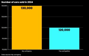
What’s the problem with this graph?
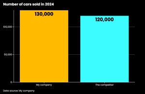
The correct visualization
The online magazine called Nightingale is, I think, a good starting point, with excellent and understandable articles appearing on current issues, methodologies, ethical aspects, or even history of data visualization. For inspiration, there’s the accessible archive of the Information is Beautiful Awards with all the award-winning works so far. There are active and important people in social media worth following: Alberto Cairo, RJ Andrews, Nathan Yau, Moritz Stefaner, Andy Kirk, Michael Friendly, Shirley Wu, Nadieh Bremer, or Jason Forrest who will visit Budapest this summer, just to mention a few names, but of course this is a subjective list. For books, I would recommend Juuso Koponen and Jonatan Hildén’s Data Visualization Handbook, Andy Kirk’s Data Visualisation: A Handbook and Data Driven Design books, and Alberto Cairo’s The Functional Art as a warm-up. If someone still wants to read about this in Hungarian, then I’m forced to recommend my own book to them, because there’s no other in Hungarian.
An award winning data visualization designer and assistant professor of information graphics at the Media Department of Eötvös Loránd University. As the founder of Átló data-driven visual content production team, he has been involved in several locally and internationally acclaimed data visualization projects. He regularly gives workshops and presentations for companies and NGOs. In 2023, he won silver at the Information is Beautiful Awards, the same year one of the most influential data visualization theorists in the world, Alberto Cairo included him amongst the most important information designers in his book ‘Art of Insight’. More info: https://attilabatorfy.com/
