
It is almost a truism that we live in a visual age. We take and post pictures of every moment of our lives, watch videos or even look at funny gifs and other animations. Media products are also becoming more visual: newspapers and news portals are getting bigger and more colourful. This affects the expectations of journalists and therefore the work of PR professionals. Do journalists use corporate illustrations? What is the easiest format to use in an article? What makes a good infographic? These are some of the questions we sought to answer in Probako’s research with journalists.
The vastly increased visual demand for content in print and online media products is illustrated by the fact that the vast majority of the dozens of journalists and editors who responded to our questions are very happy to receive and typically use illustrations. There are many types of illustration, but not all are equally good and useful for media content producers. The responses suggest that traditional images, infographics and video are the most helpful. Of course, the more corporate branding the visuals have, the less useful they are. So it pays to include illustrations in your communications that cleverly convey your corporate message but are subtly branded.
Traditional media also tend to stick to the tried and tested when it comes to illustration. When asked, journalists told us that when it comes to images, they prefer lying jpg files. Although there is a large social media following for various types of gifs, the responses suggest that this may be counterproductive in the press for the time being. Most respondents rated this type of illustration as the least useful.

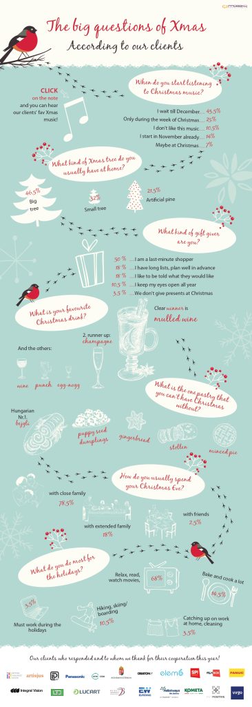
Infographics are generally used successfully in media relations. The question is: what makes a good data visualization? Journalists have their own opinions. According to our respondents, an infographic is good if:
In the context of what might be a less successful graphical presentation of data, they also discussed what might be off-putting about an infographic sent by a company. If you think a giant company logo and overwritten text is the way to go, you’re on the right track. It is also unfortunate if the material tries to include every little nugget of data from the research.

The clear lesson from Probako’s research is that PR professionals need to be increasingly visual. Whatever you can, it is worth illustrating always add a picture, an infographic or a video to your communication. Of course, quantity is no substitute for quality. Illustrations can only have the right impact if they are created by professionals with a good feel for the subject.

If you need help with professional illustrations for your PR materials, contact us at szabo@probako.hu or visit Home | Prbk Design Lab.